
I’ve been asking everyone: Show me the all-cause mortality data proving the vaccines are safe. I finally got some data. It’s from the UK government and it’s devastating. REALLY devastating.
Steve Kirsch
May 5
Overview
New UK government data allows us to analyze the data in a way we couldn’t before. This new analysis shows clearly that the COVID vaccines kill more people than they save for all age groups. In other words, they shouldn’t be used by anyone. The younger you are, the less sense it makes.
Anyone can validate the data and methodology. The results make it clear that the COVID vaccines should be halted immediately.
Not a single public health authority in any country will have a conversation with us on the record to justify their vaccine recommendations or explain how this analysis is wrong. I wonder why?
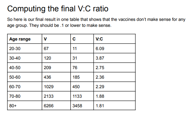
What the data shows
Here’s the result of the analysis.
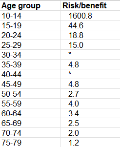
What this means is that if you are 25 years old, the vaccine kills 15 people for every person it saves from dying from COVID. Below 80, the younger you are, the more nonsensical vaccination is. The cells with * means that the vaccine actually caused more COVID cases to happen than the unvaccinated.
Above 80, the UK data was too confounded to be useful. Until we have that data, it’s irresponsible to make a recommendation.
I describe below how you can compute this yourself from the UK data.
Please share this result on all your social media platforms. One user got 10,000 likes in less than 24 hours on Twitter and he had only 2,000 followers. So Twitter permanently suspended his account. So probably not a good idea to share on Twitter. According to Twitter, “health officials consider the COVID-19 vaccines safe for most people” and therefore any UK government data that shows that they are lying is a violation of Twitter Community Standards.
Introduction
One of my friends recently sent me a link to the mortality data from the UK government Office of National Statistics from January 1, 2021 to January 31, 2022. I had not seen this data before so I analyzed it.
What I found was absolutely stunning because it was consistent with the VAERS risk-benefit analysis by age that I had done in November, 2021.
Where to get the UK government source data
The government data is archived here. You want to open the spreadsheet, and look at the spreadsheet tab labeled Table 6.
You can also access the original source at: https://www.ons.gov.uk/peoplepopulationandcommunity/birthsdeathsandmarriages/deaths/datasets/deathsbyvaccinationstatusengland which you can see at the top of the page.
In either case, you click the green button labeled “xlsx” to get the spreadsheet, then go to tab “Table 6”:
To visualize it, see this tweet.
Note: The data is from England only, not all of the UK.
Where to get my analysis of the data
I annotated the UK source data and you can download it here. This makes it easier to see what is going on. You can see all the original data and my formulas for calculating the ACM ratios and risk benefit analysis on the Table 6 tab.
It is all in plain sight for everyone to see. I then copied values to the Summary and Exec Summary tabs.
Methodology
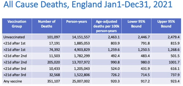
I compared the all-cause mortality (ACM) for people who got 2 shots at least 6 months ago with the unvaccinated. The 6-month time frame provides a minimum reasonable “runway” to observe the outcomes for the typical “fully vaccinated” person.
Summary of the data
This summary below (which I put on the Summary tab which is to the right of the Table 6 tab) shows the rates of all-cause mortality per 100,000 person-years for each age range and also shows the risk benefit ratio.
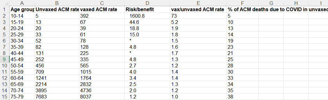
Here’s the legend for each column:
- A: age range for the row
- B: ACM rate for unvaxxed
- C: ACM rate for vaxxed
- D: Risk benefit calculation which is # non-COVID lives lost due to the vaccine / # of COVID lives saved from the vaccine. This is the single best metric for justifying the use of an intervention. The larger this number is, the less sense the intervention makes. A value >1 means the intervention should never be used. The cells with * means that the vaccine actually caused more COVID cases to happen than the unvaccinated. Note: you need to view the full spreadsheet to see the data used to calculate this number. You cannot do it from the summary data on this screen.
- E: ACM of vaxxed/ACM unvaxed, i.e., Column C/ Column
B. A value >1 means the intervention should never be used since it is costing lives. This is a crude measure of the effectiveness of an intervention as we explain below. - F: % of ACM deaths due to COVID, i.e., the fraction of all the ACM deaths that were caused by COVID.
The data clearly shows that any mortality benefit you get from taking the vaccine and lowering your risk of death from COVID is more than offset by the mortality you lose from the vaccine itself. This isn’t new. It is something I have been saying since May, 2021. But now I finally found the data where I could calculate it reliably.
In the Pfizer Phase 3 trial, there was a 40% increase in ACM in the vaccinated group. They killed an estimated 7 people for every person they saved from COVID!
In the Pfizer Phase 3 trial, there were a total of 21 deaths in the vaccine group and 15 deaths in the placebo group.
This 40% increase in the all-cause mortality in the trial (21/15=1.4) was of course dismissed as not statistically significant. While that is true, that doesn’t mean we shouldn’t pay attention to the number.
But now, based on the UK data, we know that the result in the Phase 3 trial wasn’t a statistical fluke. Not at all.
In fact, if we look at the risk benefit, we see that we saved 1 life from dying from COVID (1 COVID death in the treatment group vs. 2 COVID deaths in the placebo group= 1 life saved), but there were 7 excess non-COVID deaths (20 – 13).
So the Pfizer trial showed that for every person we saved from COVID, we killed 7 people. However the numbers were too small to place a high confidence in this point estimate.
However, I’d argue that Pfizer trial was a best case because:
- The trial enrolled abnormally healthy people who died at a 10X lower rate than the population (there is a 1% US average death rate per year, yet there were just 15 deaths in the 22,000 placebo arm in 6 months which is a .1% death rate)
- They were able to get rid of anyone who had a reaction to the first dose without counting them
The most important point though is that the Pfizer trial killed:save ratio of 7:1 and the ACM ratio of 1.4 is consistent with the hypothesis that the vaccine kills more people than it saves.
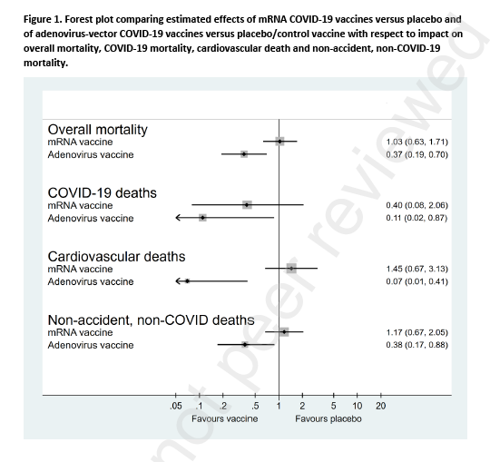
My ACM risk/benefit estimate using VAERS
This is from a risk/benefit computation I did on November 1, 2021 using the VAERS data to compute the ratio of the # of people killed from the vaccine (V) to the # of people who might be saved from COVID (C) if they took the vaccine and it had 90% effectiveness over 6 months (since we knew it waned over time and variants would change). Of course that was a conservative estimate of the benefit, but that’s because I wanted to make sure I was on solid ground if attacked.
So now we know that my VAERS calculations approximately match the actual UK data in Figure 1. Since my analysis was deliberately conservative, many of the numbers are smaller than the actuals.
This is another example that people who claim (without evidence) that the VAERS data is too “unreliable to use” are wrong. If it is so unreliable, how did it match the real world UK results so well?
Note how that VAERS showed exactly the same effect back then that we just learned from this UK data: that the younger you are, the more nonsensical getting vaccinated is.
Our V:C column decreases as you get older (from 6:1 down to 1.8:1) just like column E decreases (from 1.9:1 to 1:1 over the same range) in Figure 2.
Isn’t that an interesting “coincidence”? They are within a factor of 3 of each other.
Confirmation from others
I’m hardly the only person noting that the COVID vaccines kill more people than they save. Other articles show either no benefit at all or a negative benefit.
For example, check out:
- 99.6% of COVID deaths in Canada were among fully vaccinated people between April 10-17 which can only happen if the vaccinated have a great ACM than the unvaccinated since there is only an 86% vaccination rate in Canada. This is hard for anyone to explain.
- Fully Vaccinated 6x Higher Overall Mortality Than Non-Vaccinated (October 30, 2021)
- Follow-up of trial participants found ‘no effect on overall mortality’
-
Figure 4. Table from the Denmark paper published as a preprint in the Lancet - Horowitz: The failure of the mRNA shots is on display for all with open eyes
Note that the Denmark paper (pre-published in the Lancet) showed overall zero all-cause mortality benefit based on clinical trial data. That’s certainly more optimistic than the UK numbers, but the problem for the vaccine makers is that the UK numbers showed up to 38% of the deaths were from COVID so if the vaccines actually worked and were safe, you’d see a huge ACM benefit and you saw nothing.
Why are we mandating a vaccine with a zero ACM benefit?? No public health official wants to answer questions about that.
What makes this analysis different than previous work
The dataset used here contains both COVID and non-COVID deaths by age. We haven’t had that before.
This enables us, for the first time, to validate the data as we explain in the next section.
In short, the data we have in this dataset is more detailed than in the more frequently cited UK Health Security Agency summaries.
The sanity check
It’s important to do sanity checks on the data to avoid confounding problems since this wasn’t a randomized trial.
In particular, the all-cause mortality (ACM) rates for NON-COVID deaths in the vaxxed cohorts should be the same as the rates for the unvaccinated for a perfectly safe vaccine; it should be higher for sure for this vaccine as we know from VAERS, I guarantee it. We have over 10 ways showing that this vaccine significantly INCREASES your non-COVID ACM.
Therefore, anytime that non-COVID ACM is lower for the vaccinated than the unvaccinated in any age cohort, the data is unreliable (either corrupt or seriously confounded). You’ll find it is lower for most of the rows in the data presented by the UK government. That’s impossible. It shows the data is unreliable. Others noticed this as well.
This is the reason I like this dataset so much: it has the non-COVID ACM so we can sanity check it.
The sanity check is the reason I focused on the 2 doses >6 months row because it passed this simple sanity check more consistently than any other row.
If you ignore the sanity check and include all the data for the vaccinated in the UK report, then the vaccines are marvelous life savers but ONLY if you are 25 years old or older. The vaccine will keep you from dying from cancer, car accidents, etc. especially if you are elderly. It’s like a fountain of youth for the elderly if you do that. Which doesn’t jive at all with reality where funeral home directors like John O’Looney couldn’t believe how many calls he was getting of elderly that had died when the jabs rolled out.
So if you use the other data, you need to make sure you have properly corrected the data before you use it in any calculations. I wasn’t able to figure out how to do that, but if you can, please post your analysis for all of us to see.
Here’s a more in-depth explanation of the confounding due to survivor bias which explains why these data sets are not constructed for our purposes.
All the data we used met our simple sanity check criteria.
Could my sanity check be wrong because the vaccine is actually able to keep you from dying from all diseases and also accidents as well? Nope. VAERS would be empty if this drug reduced adverse events and doctors would report elderly people being cured of disease. Instead of adverse event reports, doctors would be filing Beneficial Event Reports (BER) after vaccination.
I’ve written about this supposed “fountain of youth” effect on November 12, 2021.
Should those over 80 get the shot?
My VAERS analysis said no.
The anecdotal data from nursing homes from whistleblowers all says no (see slides 53 to 59). This includes Abrien Aguirre on Oahu, Sunnycrest nursing home in Canada, and John O’Looney’s experience, and experience from embalmers where most of the bodies being embalmed have telltale blood clots caused by the vaccine.
Based on curve fitting, it doesn’t look good for the elderly, for either (see this reader comment for details).
The UK dataset used in this article was too confounded to use since the non-COVID ACM rate for the vaccinated was lower than the vaccinated so it didn’t meet the sanity check.
So if I was over 80, I wouldn’t get the shot until I saw reliable, self-consistent data showing a clear benefit from multiple independent sources. Seen any of that lately?
ACM ratio vs. risk/benefit analysis
Now that we have the basics out of the way, I want to explain in greater detail the difference between the ACM ratio and the risk/benefit number and why the latter is what we should be focusing on.
For example, Toby Rogers estimated that we kill 117 kids from the COVID vaccine for every child we might save from dying of COVID in the 5 to 11 age range.
Here, in an even older cohort (10 to 14), we found it is 1600 to 1. The problem with this young age range is that there are so few deaths, that there is a lot of statistical noise since the denominator is so small (close to 0). But the UK data clearly showed that vaccinating kids younger than 20 years old is insane. Arguing whether it is 117 or 1600 is like rearranging deck chairs on the Titanic.
Here’s a simple example to illustrate the difference between the ACM ratio and the risk benefit analysis:
- Suppose 100 people per 100,000 die per year normally in a particular age group.
- We have a vaccine that saves 1 life per person, but kills 10. That’s a lousy intervention because it kills 10 times more people than it saves.
- But if we compare the ACM rates of the two groups, we’d have 100 in the unvaccinated group and 109 dead people in the vaccinated group. So the ACM ratio would only be 1.1, a 10% increase. But the risk/benefit is 10:1 more risk than benefit.
So that’s why the risk-benefit ratio is the number to look at, not the ratio of the ACMs of each group.
Attempts to debunk this
Professor Jeffrey Morris has the explanation in his blog post, “UK death data artifacts: “Stragglers” who delay vaccine doses a select group with higher death risk.”
David Wilson, aka “Debunk the Funk,” cited Morris’s article when I asked him to debunk this article. No other explanation provided.
Morris claims that people who vaccinate late have higher death rates.
For second dose people, you can pick from one of three options:
- >6 months ago (the “most prompt”)
- 21 days to 6 months ago (the “middle”)
- <21 days ago (“the stragglers”)
Guess which row I picked for the analysis? The people who were the most prompt, not the stragglers.
So much for the hand-waving debunk attempt. I was not impressed.
The superior way to debunk my article is to point out that if I had chosen other rows, the result would have been different. That’s true. I selected the row that I did because it passed a basic sanity test: that vaccines aren’t a fountain of youth for other diseases and accidents.
I’m confident that I’m right because the result is very consistent with other reliable independent data points that I know. But I can see how how others can create FUD about the result here by saying “look over there.” My counter to their argument is “you are deflecting attention elsewhere instead of explaining why this analysis is wrong.”
For example, this table from Morris’ article is from the UK dataset as well, and it indicates you are way better off if you got the vax.
The problem is death rates that are as low as 20% of the unvaxed death rate (as noted in this table) doesn’t match reality such as the up to 21X increase athlete deaths (Jan 2021 vs Jan 2022) that we can see in plain sight. Nobody has been able to explain away the athlete data, not even Professor Glen Pyle. While government data can be manipulated, athlete deaths cannot be manipulated because they are public. Which do you trust more? Clearly, the data that is in full public view.
Also, in Table 3 of the UK data, it says if you’ve been vaccinated with COVID, you have close to half of the non-COVID ACM death rate as the unvaccinated (compare E23 with E31).
In other words, according to UK government data, the vaccine is a fountain of youth because it will reduce your non-COVID ACM by a factor of 2. It’s just not believable. There is no mechanism of action that can do that and you’d expect the VAERS reports (and individual doctor reports) would all be lower than previous vaccines in all categories rather than off the charts. Furthermore, if the COVID vaccines reduced non-COVID ACM by 2X, the government would be shouting this from the rooftops as a miracle cure for all diseases. They aren’t. They are silent. What does that tell you? It tells you the UK government doesn’t believe their own data, that’s what it tells you.
Or as President Obama might phase it: “Let me be clear, the UK government doesn’t believe it’s own data.”
Figure 5 above is also inconsistent with Canada’s high rate of fully vaccinated deaths, the huge number of VAERS reports, reports by individual doctors of 100X or more increase in adverse events after vaccination, Facebook groups with hundred of thousands of vaccine victims, the huge spike in athlete deaths, the 75% of radiologists at UCSF/Marin who refused the booster, etc.
Limitations
Here are some limitations of using the UK data courtesy of Martin Kulldorff, the most important one being the first one.
Does this cause me to doubt the results? No. These limitations may change the numbers a bit up or down, but I doubt it would change the general result. We have way too many real-world confirmation points that could not be explained if the vaccine were beneficial (see my list of questions).
- Seasonality: In England, all-cause mortality is highly seasonal (https://www.nature.com/articles/146126b0), as is COVID mortality as well as COVID vaccinations. This creates a bias in the analysis. There is much more unvaccinated person time during the early part of 2021, while there is much more D2 6+ month person time in the later parts of 2021 and January 2022. To adjust for this bias, in whichever direction it goes, it is necessary to adjust for calendar time. Depending on the data, that can be done in different ways. Note that this bias affects the results differently for different age groups, both because the rollout of the vaccine varied by age group and because the seasonal mortality patterns may differ by age.
- Negative efficacy on COVID: The negative efficacy on COVID mortality in the 30-34 and 40-44 age groups (the * rows) may seem counter intuitive, but there is a likely explanation. The same phenomena was seen an a recent New York State analysis of COVID vaccines in children. In that study, the vaccine was effective at preventing symptomatic COVID during the first few weeks after vaccination, but for 5-11 year old children, the efficacy we negative after seven weeks, so that there were more COVID in the vaccinated than the unvaccinated. The likely explanation for this is that the vaccine provides temporary protection during the first few weeks, so after 7 weeks we are comparing unvaccinated children with a high proportion of natural immunity from having had COVID with vaccinated children with a lower proportion with natural immunity. This phenomenon will be seen with any vaccine that only gives short-term protection, and it could potentially also affect COVID mortality statistics. Suppose that the vaccine does not prevent COVID deaths, but just postpone them until a later date. Then there may be a vaccine benefit seen 0-6 months after vaccination, but a vaccine harm 6-12 months after vaccination. When Pfizer and Moderna only evaluated the vaccines for a few months, that give incomplete and potentially misleading information about the efficacy of the vaccines. The same is true if we only look at a subsequent tie interval of e.g. 6-12 month after the vaccination. There are ways to overcome this issue, but I am not sufficiently familiar with the English data to know if it can be extracted from that.
- Prior COVID infection: The unvaccinated group consists of two sub-groups,
(i) those who have recovered from COVID and who hence have natural immunity to COVID, which is superior to vaccine induced immunity, and (ii) those who have never had COVID. People with natural immunity have minuscule if any benefit from the vaccine on COVID disease and should not be vaccinated. To determine whether those without a prior COVID infection benefit from vaccination, it is necessary to compare the vaccinated without a prior COVID infection with the unvaccinated without a prior COVID infection.
- Risk metrics: Although both are worth calculating, I agree that risk/benefit is a more relevant number of vaccine efficacy than vax/unvax ACM rates. The best metrics to evaluate the vaccines is not a risk ratio though, but attributable risk. That is, for every 1,000 people who get the vaccine, or for every 1,000,000, how many deaths are prevented by the vaccine or how many deaths are caused by the vaccine.
Who is right?
There are always going to be studies that contradict other studies.
There are always going to be compromised data sources, the DMED data being another recent example.
There are always going to be seemingly credible sources of data that are not as credible as they seem at first glance:
Our job is to sort out the reliable data from the unreliable data. We do that by using multiple pieces of independent evidence from credible sources and doing sanity checks on the data we use.
“Show me the DATA”
Remember the movie Jerry Maguire where Rod Tidwell advises Jerry that to keep him as a client all Jerry has to do is “Show me the money!”?
We should all be asking the same thing of the CDC but instead of money, we should be asking them to “Show me the DATA!”
Why isn’t the CDC showing us the ACM study that we need?
Since the clinical trials were unblinded, we can’t use that data. Instead, what we need to see is a retrospective study of matched individuals with 100,000 in each group selected on December 1, 2020 before the vaccines rolled out to the public if we want to know if these vaccines are reducing deaths.
One group goes the full vax route. The other group shuns the vax entirely.
You then look at the number of COVID vs. non-COVID deaths in each group and compute the risk-benefit analysis as we did earlier.
That’s the data I want to see. Where is it? Nobody has been able to show me.
And without that data, nobody of any age should get the jab or recommend it.
I’ll go even further and say:
- It is irresponsible for the CDC to keep that data hidden from public view.
- It’s irresponsible for the medical community to not demand to see this data.
- It’s irresponsible for the medical community to encourage anyone to get vaccinated without seeing this data especially in light of the alarming data in VAERS and other sources.
- If the vaccines are beneficial, then how do you explain away this new analysis of the UK data?
Summary
Based on this new UK government data, we can finally compute a true risk-benefit ratio for each age group. For all groups, it’s negative. The younger you are, the less sense it makes to take the vaccine.
The bottom line is this: finally, the data is publicly available in plain sight that shows clearly that our governments have been publicly killing us with these vaccines and vaccine mandates.
The data analysis is not attackable either. It is fully reported data right from the UK government and the math is straightforward. The only way to explain the results is that the vaccines kill more people than they save.
It’s deplorable that the medical community never even asked for this data before recommending the vaccines. They continue to this day to keep their head in the sand and not demand to see the ACM data.
Please share this article and help us get the word out.
