
Reproducing Edward Dowd’s Excess Death Percentage charts from public CDC source data.
|
|
Milo Mac
|
|
A few weeks ago, Edward Dowd presented a data set on Steve Bannon’s WarRoom that showed excess mortality by month for various age ranges. See here.
In the interview, Ed describes the work an associate of his, an actuary, did with regards to developing the charts for each age. Through my communications with Ed on Gettr, I offered to see if I could reproduce the charts from the raw data.
Ed describes some work that needed to be done with the original data to develop baselines for each age group in order to calculate excess death percentages. Presumably, this is because the original data set had a base line in aggregate but not for specific age groups.
I began with the original data set and also created baselines for each age. Admittedly, I took a couple of short cuts with regard to expect average deaths and seasonality but I figured with the level of disruption we are seeing, it would be close enough to confirm Ed’s work.
I was right. My development match Ed’s close enough to confirm it. However, while doing additional research, I came upon a CDC data set that already included baseline expected deaths by age group. Not only the age groups used by Ed, but even more granular at 5 year intervals. It also delineated by gender and ethnicity.
The data set can be found here:
See this Gettr post if you want to derive the percentages yourself. If you know how to create a pivot table in Excel, it takes less than 5 minutes.
What this means is that I can now create versions of Ed’s charts based on CDC baselining methodologies (they confirm Ed’s – see below) but I can also dig in deeper and create comparable charts for various sub-groupings.
The data set also delineated COVID versus Non-COVID excess deaths. This is a split that was not present in Ed‘S development and, as we will see, adds a level of complexity in understanding what the data is telling us (I encourage you not to rush to judgement once you see the charts).
Before I discussed this any further, here is my development. For each age grouping, I include my aggregate chart, a chart that breaks it apart by COVID and Non-COVID and a chart that overlay’s Ed’s chart to show how they compared.
Let’s start with the Millennials.
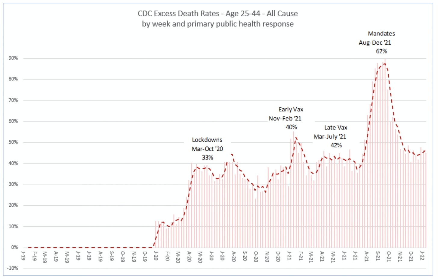
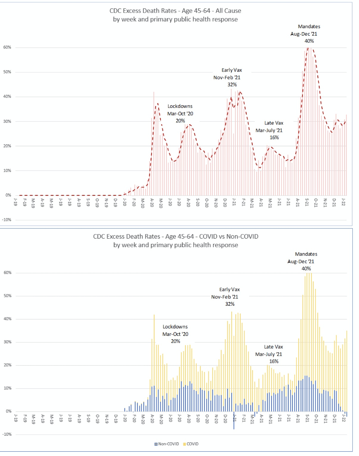
Ages 25-44
Here is my version of the Millennial chart based on the CDC data.
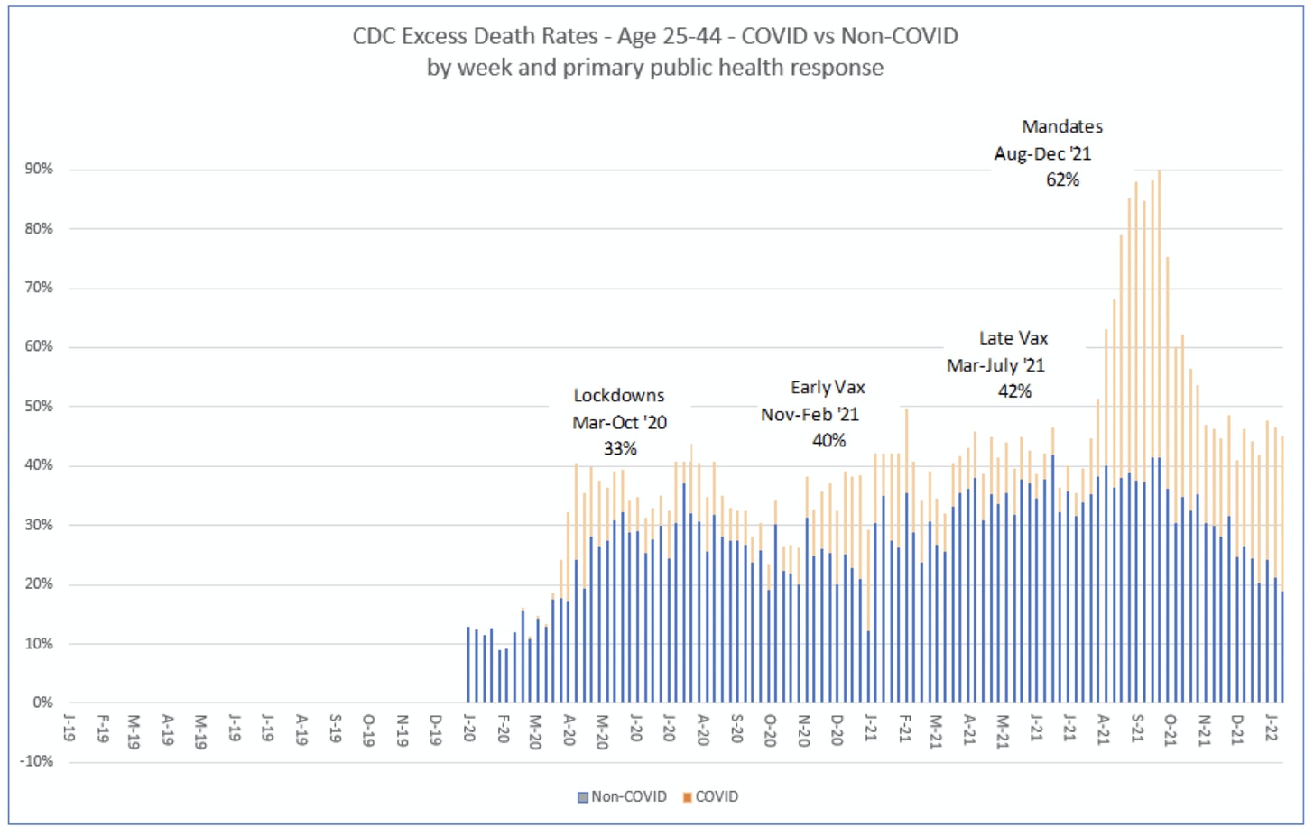
Here is the chart that breaks out COVID and Non-COVID
Here is the overlay for comparison to Ed’s. You can see they are very close. What I found is that for each of the age groups, my percentages are slightly higher than Ed’s. I noticed the same thing when I compared my derived percentages to the CDC numbers so it may have to do with a slight bias in developing the base line. In any event, the differences are small relative to the level of excess deaths.
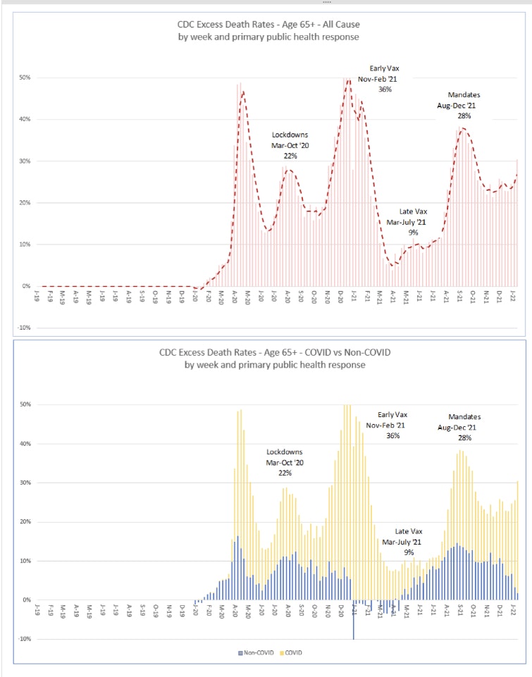
What you probably noticed right off the bat in the second chart is that the bump in excess percentage deaths from August to December 2021 appears to be driven by an increase in COVID rather than an increase in Non-COVID (e.g. including vaccines) deaths. This is where we need to take a step back and think it through.
The stacked bar chart showing the COVID and Non-COVID contribution to excess deaths shows a pronounced increase in COVID deaths in third and fourth quarters of 2021. This coincides with the introduction of mandates but also with the Delta variant surge in the United States. The question is raised as to whether the substantial spike in excess deaths from August 2021 to December 2021 is related to the vaccines or is it simply just more COVID?
I believe the answer may be a combination of things. Consider the following:
- We know that COVID deaths are overstated, for at least two reasons. The first is high cycle PCR tests that overstate positive results. The second reason has to do with how COVID is determined to be the cause of death. CDC guidance instructs practitioners to include COVID as the cause if there is a positive PCR test but also if they suspect COVID or determine it was likely even without a lab test.
From the Technical Note:
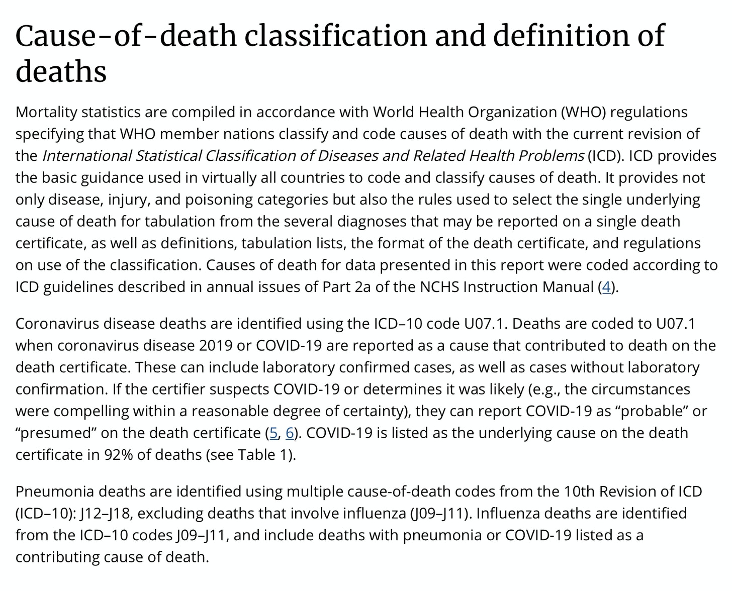
- CDC counts COVID deaths two ways. Essentially, dying from COVID and dying with COVID. The total COVID deaths included in the presented charts include both since that is how CDC reports them. Additional work should be done to adjust the COVID deaths to remove “dying with COVID”.
But even if the COVID increase is real in the August to December 2021 time frame, consider three things.
- The percent in Non-COVID excess deaths also increases in this time frame compared to earlier periods and in some cells (age, gender, ethnicity) by significant amount. This should have nothing to do with the delta variant.
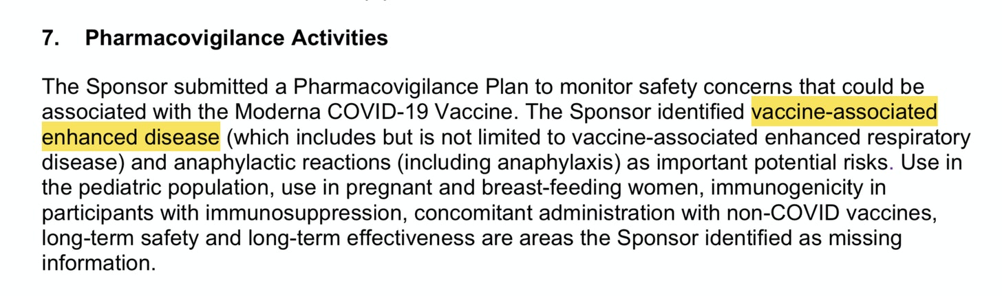
- Then there is Vaccine-Associated Enhanced Disease. This is where a vaccine causes more severe disease the next time an inoculated person comes in contact with a variant of the original strain. The FDA identified this as a risk for COVID vaccines in the original Pfizer and Moderna briefing documents.
In addition, some evidence coming out of Scotland, England and New Zealand appear to show that VAED is happening.
- A corollary to VAED is Antibody Depdendent Enhancement (ADE) which can occur as the vaccines wane. This was also identified in the original review documents. We also know that the August to December time frame coincides with the time the vaccines were expected to be waning.
So what would it look like in the data if VAED or ADE was occurring? Well, wouldn’t it look like exactly what we see? Soon after widespread vaccination, we are exposed to a variant (delta) and we see what could be considered a disproportionate spike in COVID deaths even among the younger and healthier population.
So, while we know COVID deaths tend to be overstated, it is possible that the spike we are seeing in the 3Q and 4Q of 2021 in deaths being attributed to COVID could be evidence of VAED.
More work can and should be done on this. The CDC has released data on COVID deaths with associated comorbidities that might be used to tease out additional insights. Additionally, we can look at COVID growth in the the 3Q and 4Q 2021 by age correlated to percent vaccinated.
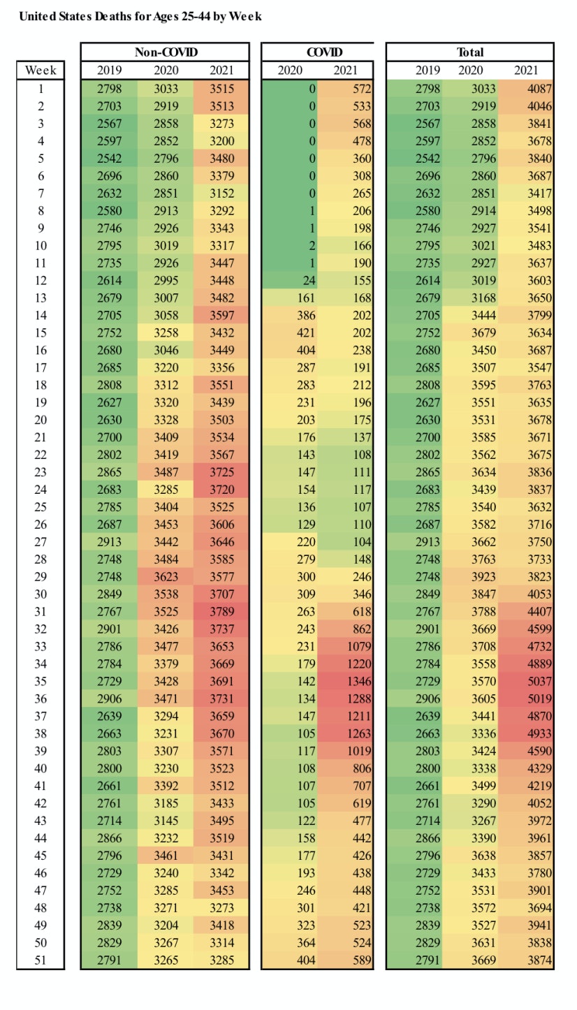
While COVID deaths do increase dramatically in the 3Q and 4Q 2021 for Millenials, we do see Non-COVID deaths also increase. Here is another view that shows that. This is a heat map that shows Non-COVID, COVID and Total Deaths for Ages 25-44 for the years 2019 through 2021. Green is low and red is high. You clearly see the spike in COVID deaths in the 3Q 2021. But you also see some read in the Non-COVID for that period.
We know from VAERS that there are vaccine deaths in the 2021 deaths somewhere in these charts. We just need to tease them out.
One thing we haven’t talked about yet are the excess deaths for Non-COVID starting in early 2020 right after the lockdowns started. In fact, looking at the Non-COVID/COVID chart above, what you see is that Non-COVID excess deaths dramatically outnumbered COVID deaths for all of 2020 and through 2021 until the COVID surge in 2021. That is important. What is causing so much excess death unrelated to COVID? I have some ideas and will be exploring that further.
I realized that I may have made an assumption that you might also have made when looking at Ed’s chart. I assumed that COVID deaths were constant and Non-COVID volumes were changing. And while Non-COVID deaths do increase in August 2021, I was very surprised to see them so high so early in the pandemic. That should not be overlooked.
That brings me to the end of this post. There is a lot to cover given the level of granularity with which the data can be examined. I will be posting to this sub stack and will link to it from GETTR. This sub stack will remain free to all.
Finally, here are the charts for the remaining age groups.
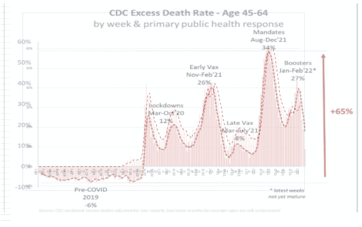
Ages 45-64 Gen X:
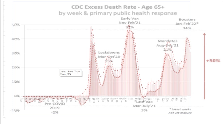
Ages 65+ Boomers:
| 46 | Share |
Content retrieved from: https://milomac.substack.com/p/excess-death-percentage?s=r.